How To Write A High-Converting Landing Page For Your Lead Magnet
This is how you turn a "rented audience" into an "owned audience"
Want to write with AI? Try Typeshare's new AI-powered Endless Idea Generator! Create, save, and expand ideas—instantly.
Ahoy, Digital Writers!
Today, we’re going to share a secret with you…
What we’re about to share with you is a strategy 99% of Digital Writers, Digital Creators, marketers, and even heads of entire content marketing departments inside multibillion-dollar companies don’t know (and certainly don’t understand).
Are you ready?
It’s called The Rule Of 1:
1 page
1 offer
1 choice (subscribe or don’t)
Here’s how it works:
If you want to move people from social media to your email list, avoid sending them to a cluttered website with a bunch of links. Instead, send them to a dedicated page where they can easily sign up for your eBook, Ultimate Guide, Email Course, or whatever you're offering. Sending them to your website with 87 different things going on just makes it 10X harder for them to find what you want them to find and type in their email address.
Keep it simple.
Keep it focused.
And you'll have a much better chance of turning free followers (rented audience) into loyal email subscribers (owned audience).
The landing page for your free opt-in should be very simple.
Almost so simple that you think, “Wait… don't I need more?”
For example, take a look at how simple our Start Writing Online landing page is.
1 page: startwritingonline.com
1 offer: “Download our Ultimate Guide to start writing online.”
1 choice: Type in your email or don’t. (No, you can’t navigate anywhere else.)
No other links, no other pages, nothing.
This is the key to increasing the opt-in rate (%) and number of people who download your product—and ultimately make their way onto your email list/newsletter.
You cannot give people more than 1 option.
Either type in your email and download this free asset.
Or don’t.
That’s it.
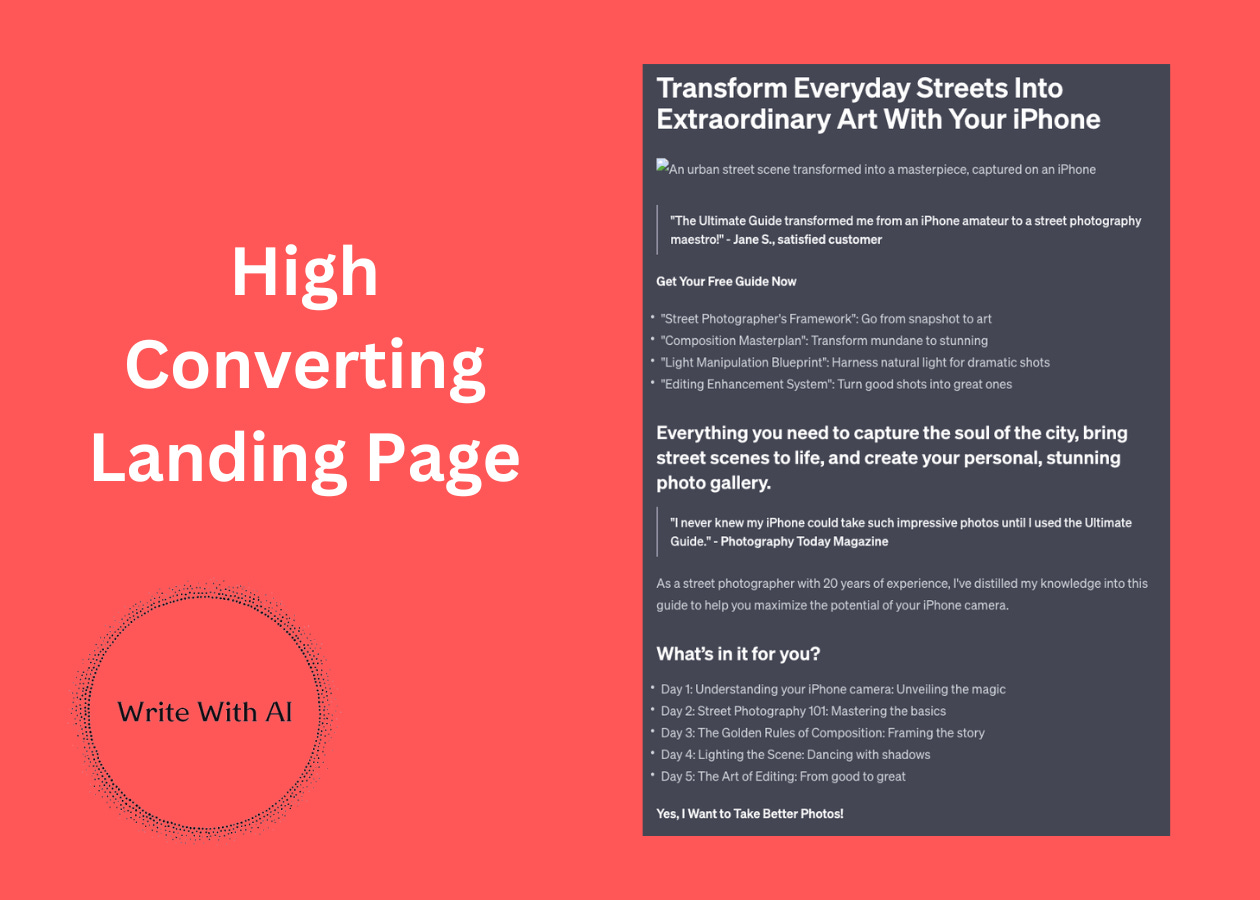
The 5 Sections For Your Opt-In Landing Page
OK, now that you understand the strategy (drive readers to 1 page, with 1 offer, with only 1 choice), let’s dig into the tactics.
Here is the information you should strive to have on your free opt-in page:
H1: {Dream Outcome}
This should be the biggest text on your landing page.
The Dream Outcome the promise you are making to the reader. And the reason why someone will choose to give you their email address is because they are confident in your ability to help them achieve that Dream Outcome.
Big Email Button {CTA}
Next, make it very obvious what you want the visitor to do.
“If you want this Dream Outcome in 7 days, type in your email here.”
No need to get fancy with it.
What Does The Person Get?
List out 3-5 “things” the person gets, or is going to learn, after they put in your email address.
For example:
The more you can emphasize “this is what you are going to receive,” the more likely someone is to subscribe.
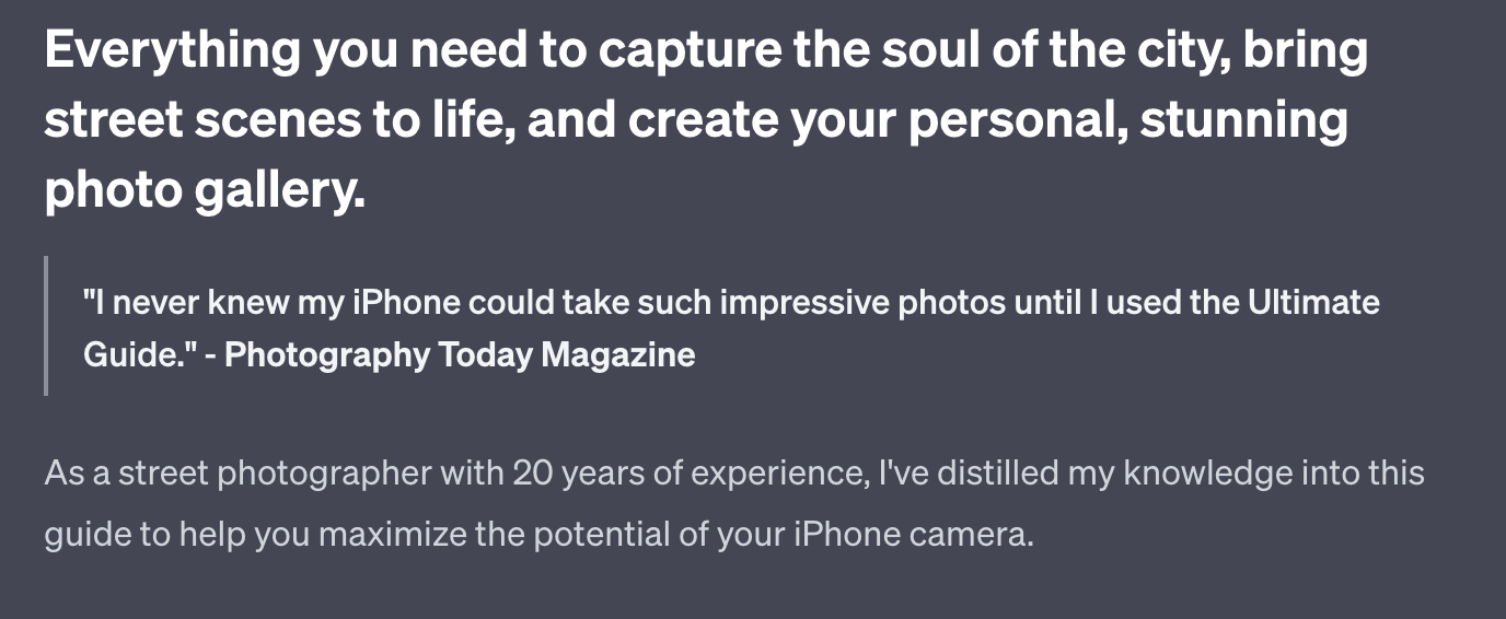
“Everything You Need To…”
Finally, tell the visitor that if they subscribe, they will get everything they need to achieve 3 desirable outcomes related to their overarching Dream Outcome.
For example:
And remember: whatever promise you make, you better keep it!
Bonus: “Want to make sure this is worth it?”
This last part isn’t required, but it’s a nice touch.
Create a final section that tells people (verbatim) what they are going to receive/learn. This helps them see exactly what they’re signing up for and what they can expect in exchange for giving you their email address.
Let’s build your landing page with ChatGPT!


