Writing effectively is one of the world’s most valuable skills.
But if you can write clearly AND communicate your ideas visually, then the world is your oyster.
Why? Because visuals imprint your ideas into your reader's brain in ways text alone can't. Most people only remember 10% of what they read after 3 days—but add a picture, and that jumps to 65%.
So, whether you’re writing a tweet, a newsletter, or a long-form post, adding a chart or quick sketch helps make your ideas stand out and stick.
Not an artist?
No problem! With Claude.ai and 5 simple steps, you can visual your expertise faster than you can say "McKinsey."
Want to make money from your expertise with email in 2025?
You’re sitting on $100,000+ worth of knowledge you can easily monetize in a newsletter.
So, let’s unlock it.
Inside Category Newsletter Creator we give you the exact playbook we used to generate $10 million in lifetime revenue for our 6 and 7-figure Digital Writing Businesses.
If you want to own your niche, build your list, and monetize forever, now’s your chance.
While there are endless ways to draw something, for educational content, you only need four types of visuals:
Why (The Ladder) - When you're showing progress
How (The Circle) - When you're showing connections
What (The Box/Grid) - When you're showing steps
What If (The Split Screen) - When you're showing transformation
Before you draw anything, you need to think about your idea and the best way to "show it."
Which brings us to the first step in the framework visualization process.
Step 1: Ask yourself: "What am I really trying to communicate?"
The way you choose a visual style is simple:
Look for the patterns in your idea.
If your idea is about:
Progress or increasing value → Use the Ladder
How things work together → Use Circles
Clear steps or categories → Use a Grid
Before/After change → Use Split Screen
For example, if you're explaining "why reading matters," you'd use a Ladder to show the increasing value. But if you're showing "how reading affects your brain," you'd use Circles to show the connections between reading, learning, and memory.
Step 2: Sketch the basic structure
After you’ve selected a visual model, the next step is to draw the basic shapes in your visual.
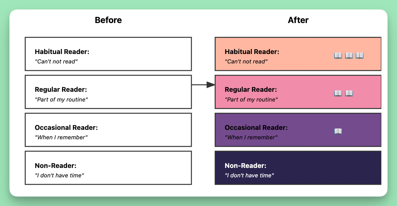
Let's say you want to visualize the idea: "Building a reading habit." Building a habit implies progress (going from non-reader to habitual reader), so you’d pick the WHY model.
Here's what the initial sketch looks like:
The first-draft results in four equal-sized boxes, stacked on top of each other—and simple labels for each level:
Non-Reader: "I don't have time"
Occasional Reader: "When I remember"
Regular Reader: "Part of my routine"
Habitual Reader: "Can't not read"
That's it. Just boxes and labels in a ladder structure.
Fight the urge to make it fancy. Just get the basic structure right first.
Step 3: Layer in ONE or TWO visual decorations.
Now that you’ve drawn your model, the next step is to decorate it.
Like the visual model, you also have four different ways to make an idea "pop":
Metaphor - Using familiar concepts (like sunrise, journey, bridge)
Comparison - Showing contrast or progression
Your job is to pick ONE or TWO ways to improve your basic drawing. Not all of them.
Here's why:
Your brain is like a busy coffee shop customer. Give them a simple menu with just a few great options, they'll make a choice and be happy. Hand them a 10-page menu with hundreds of drinks? They'll freeze up, get overwhelmed, and probably just order a plain coffee.
The same thing happens with visuals.
Every decoration you add is like adding another item to the menu. It forces your reader's brain to process one more thing:
"What does this symbol mean?"
"Why is this part bigger?"
"What's this color trying to tell me?"
"How do these things compare?"
When you use all four decorations, you're basically yelling four different messages at once. Your reader won't know where to look or what to focus on.
Let me show you how this transformed the visual we created in Step 2.
See how just two visual elements transform the basic structure?
The sunrise colors create a natural feeling of progress
The increasing number of book icons reinforces the growing commitment to reading
We didn't need to add:
Different box sizes (scale)
Arrows between boxes (comparison)
Any other decorations
Simple. Clear. Memorable.
Step 4: Give your visual the first glance test.
Step away from your picture for 5 minutes. Then come back and look at it with fresh eyes. Ask yourself: "Is this what I really want to say?"
Let's look at our reading habit diagram again:
Our first version shows a nice progression from non-reader to habitual reader. Pretty colors. Clear stages. But wait...
It's missing something crucial: the HOW.
How do you move from "I don't have time" to "When I remember"?
What makes someone shift from occasional to regular reading?
What's the actual mechanism of habit formation?
It’s missing the "Skinny To Shredded" factor.
Like a before/after fitness photo. When you see a transformation, you immediately think "How?" and click to learn more. That's what we need in this diagram.
So we made a few modifications:
Removed the middle stages to focus on the transformation
Made the contrast specific and measurable (1 book → 50+ books per year)
Added a how ("The Micro-Pages Method")
Included just enough steps to make it feel attainable but leave them wanting more
The result? A visual that makes you think: "Wait... they went from struggling with one book to reading 50+ on auto-pilot? And they did it with just 3 pages a day? How exactly does that work?"
Sometimes showing less of the process opens a loop and creates curiosity.
Now we’re getting somewhere.
Step 5: Create your own visual frameworks with Claude
All the diagrams in this post were made using Claude Artifacts.
Artifacts is like ChatGPT's Dall-E (without the crazy spelling patterns or random floating objects). It works really well for framework diagrams.
Let me show you what I mean:
(Just kidding.)
Before you start, you'll need to do two things:
Keep reading with a 7-day free trial
Subscribe to Write With AI to keep reading this post and get 7 days of free access to the full post archives.